The new Apple iOS7: My impression after a couple hours
Posted By RichC on September 19, 2013
 Evening: After struggling to download the over-the-air install of Apple’s new iOS on both iPhone and iPad (should have installed iOS7 with iTunes), the new mobile operating system is finally up and running. My first impression was my usual “oh I miss my old familiar look and feel … and I want it back.” Now take this with a grain of salt since I’m a guy who still has one Mac desktop computer running Mac OS9 (1999); in other words, this is not unusual for me to resist change. That said, IF Apple was going for a clean, bright, flowing and sliding panel oriented look and feel, they have accomplished it. Personally, I didn’t need the extra space padded around text cells or jumping open and closed menu bars, etc. After the first hour I’m also finding the new message bubbles more difficult to read.
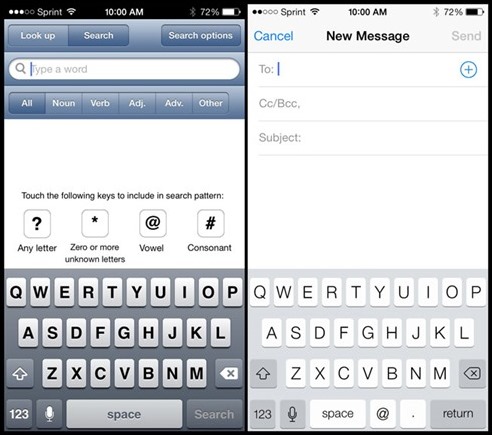
Lunch: Well par for the course … I fell asleep before finishing the post last night and will finalize with just a couple more quick observations. The new “cover-flow” feature (left) might make looking through open tabs on Safari easier for some, but I preferred the tiny tabs displayed all the time even if they are piled up. As for typing, I complained about the loss of a physical keyboard when switching to an iPhone, but the old virtual one was easier to look at and use in my opinion (below).

The older style iOS6 keyboard on the left and the newer iOS7 on the right.
As for glitches, well I’ve only stumbled a couple times when opening apps. The WSJ app crashed this morning and the Overdrive app for borrowing and reading library books continues to crash when trying to read books … although will allow me to checkout another (but it won’t download without crashing).
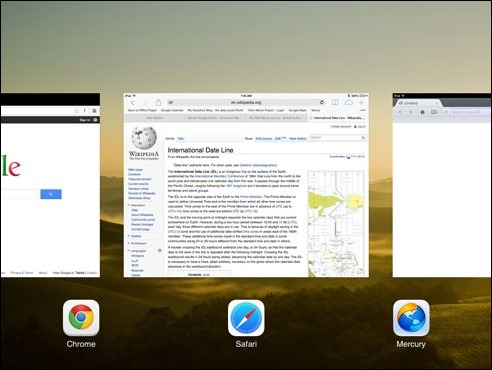
Another one of the continuing and more annoying quirks is the inability to “kill” all the apps that may have been opened at on time. I was hoping for a single “kill all” feature to be added, but instead Apple decided to make it even more difficult than before (use to have a whole line of icons). In iOS6, a double tap on the home button and holding down on one of the open app icons would allow one to rapidly tap of the “x” to kill open apps one at a time, but quickly. Now, to kill an app, you need to swipe each one away (but up to 3 at a time) with only 3 of the opened apps appearing on the full screen. Something tells me someone at Apple isn’t listening to their users – I’m including a screen shot from the iPad below. (Maybe I’m missing something???)
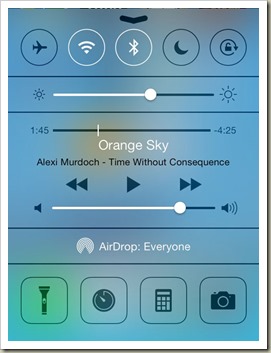
I’m sure there will be more “learning” to adapt to a new mobile operating system, but my first impression is that I wish they would have kept the good things and given us a few more useful improvements like the handy “Control Center.” Swipe up and there’s a bunch of handy feature including the new flashlight, timer, world clock, calculator and AirDrop, along with quick on-off radio switching and music.


The Reminder app has excessing cell spacing (left), but Control Center (right) is nice!

Comments