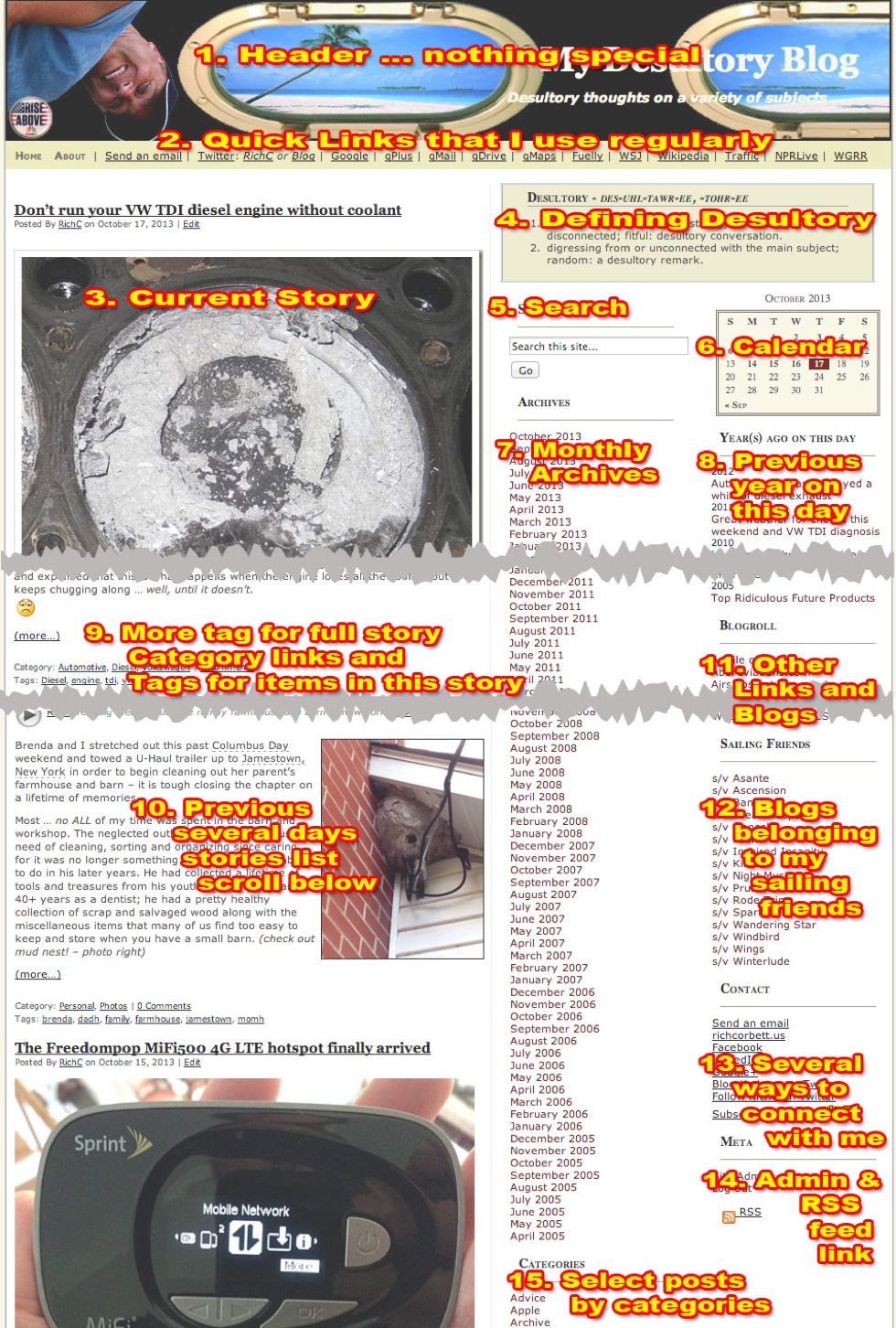
The layout and columns on my blog in 15 points
Posted By RichC on October 19, 2013
 After offering a little tech help to a computer novice setting up email and an a few bookmarks, my friend asked me why some web pages are so “busy and confusing.” He was refering to the columns and underlined words in of all places … MY BLOG.
Hmm … is it that confusing I wondered? Maybe because I look at it everyday and am regularly on the Internet I don’t realize just how much information is packed in on My Desultory Blog. It might be confusing it might be to a first time reader?
So its time to make a visual 15 point “site map” as a way to explain the 3 column WordPress theme that I’ve modified over the years. Someday I might opt for a new super-clean look … but for now the cluttered look with simple Craigslist type links is what I like (click image for larger).

Comments