With June 2020 behind us, how is Ohio handling COVID19?
Posted By RichC on July 2, 2020
It sure would be nice to report all is well in Ohio, but unfortunately our returning to semi-normal routines and statewide reopening has hit a snag … at least according to those elected and paid to monitor our health. See coronavirus.ohio.gov.
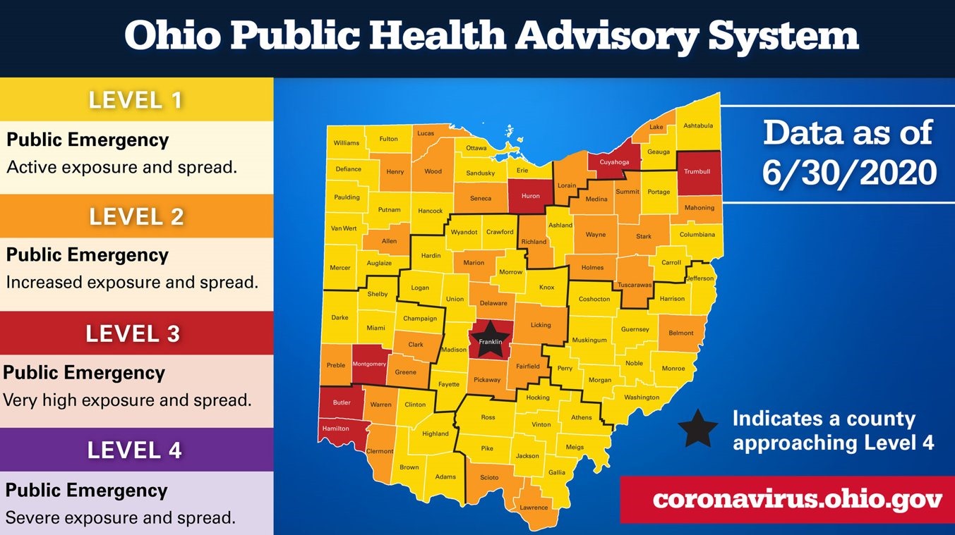
ALERT LEVELS: (all include “Follow all current health orders”)
- Active exposure and spread.
- Increased exposure and spread. Exercise high degree of caution.
- Very high exposure and spread. Limit activities as much as possible.
- Severe exposure and spread. Only leave home for supplies and services.
 Ohio’s Gov Mike DeWine sent our a series of tweets today and the map above reads like a school grade card – a few counties are not getting an acceptable grade, including ours. I’m sure there will be those for a variety of reasons who will debate the numbers (more testing, younger people infected, protests, etc) and fear the data is not being interpreted correctly. Reading the data is above my pay grade, as it has been for most of the so-called experts … so I’ll continue to do my part to limit my trips and public interaction, wear a face mask when going to the stores and social distance. Numbers aside, I doubt Ohioans or the nation will tolerate another lockdown.
INDICATORS USED FOR ABOVE MAP: (7)
- New Cases per Capita (When the data show that a county has had an average of 50 cases per 100,000 people over a 2-week period, that triggers a flag for an increasing case rate. Using this data means we are taking into account population of a county when monitoring case increases)
- Sustained Increase in New Cases (If the number of new cases in a county continually increases, that’s another indicator of virus spread. A county will be flagged for meeting this indicator if the data show at least a five-day period of sustained new case growth.)
- Proportion of Cases Not Congregate Cases (Data showing more than 50% of new cases originating from non-congregate settings during at least one of the past three weeks will trigger a flag on this indicator.)
- Sustained Increase in Emergency Room Visits (ER data will show us the trend in the number of people who visit an emergency department with COVID19 symptoms or a COVID diagnosis as a result of the visit. A county is flagged when there is an increase in such ER visits over a five-day period.)
- Sustained Increase in Outpatient Visits (This data set looks at the number of people visiting outpatient settings, including telehealth appointments, with suspected or confirmed COVID19 symptoms. A county is flagged when there is an increase over a five-day period.)
- Sustained Increase in Hew COVID-19 Hospital Admissions (When the numbers show at least a five-day period of sustained growth in the number of county residents with COVID-19 who are admitted to a hospital, the county will be flagged for meeting this indicator.)
- Intensive Care Unit (ICU) Bed Occupancy (A county is flagged for this indicator when the regional ICU occupancy goes above 80% for at least three of the last seven days.)
Comments