TechFriday: Yahoo and Google adopt new look to ire of users
Posted By RichC on July 7, 2017
Complaining is getting me nowhere … but those of us old school users of Yahoo and Google continue to be frustrated to see both companies going down the "design for smartphone – card look format" to their pages, even for large display computers.
YAHOO
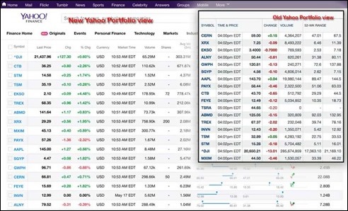
A few weeks ago Yahoo Finance forced all users to give up their "classic view" portfolio pages that many including me have used for over a decade. The "new" view shuffles what is displayed on a "row" for each ticker AND adds white space and less information which is the trend for smaller screen smartphone use (lost "notes column" and others). This new portfolio eliminates what was "a nice full screen" of data for computer use and is now sluggish to scroll or quickly scan through "spreadsheet-like" amounts of tightly packed data. I complained (as did hundreds of others) and eventually stopped using Yahoo Finance and their portfolios.
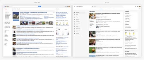
So, I rebuilt the portfolios using Google Sheets which takes far more management and is not nearly as workable as Yahoo’s "old" portfolios were. I opted for Google rather than a Microsoft Excel spreadsheet since I regularly used the Google News page. Now, Google has force switched users of their pages to their new format and is heading down the same design path. Their design team seems to be "pleased to announce" the "new UI having a clean and uncluttered look, designed for comfortable reading and browsing."
I disagree with their decision to give up function and ease of use for artistic and trendy looks. A quick glance at the above screenshots will illustrate how much less information (stories) can be displayed on a computer screen with out scrolling and jerking up constantly just to scan stories. I could not be more frustrated … as are a lot of other users.
As with Yahoo … I doubt complaining will get us anywhere. Time for changing again and looking finding both a new "news" and "portfolio" data aggregator — suggestions?


Comments